You want a statue to feel just as right in real life as it does in the photo. So don’t start with “which one is the prettiest,” start with use and placement. If you first decide where it will go and what you want it for (looking at it, daily use, collecting), it becomes much easier to choose an age and style that make sense for your space.
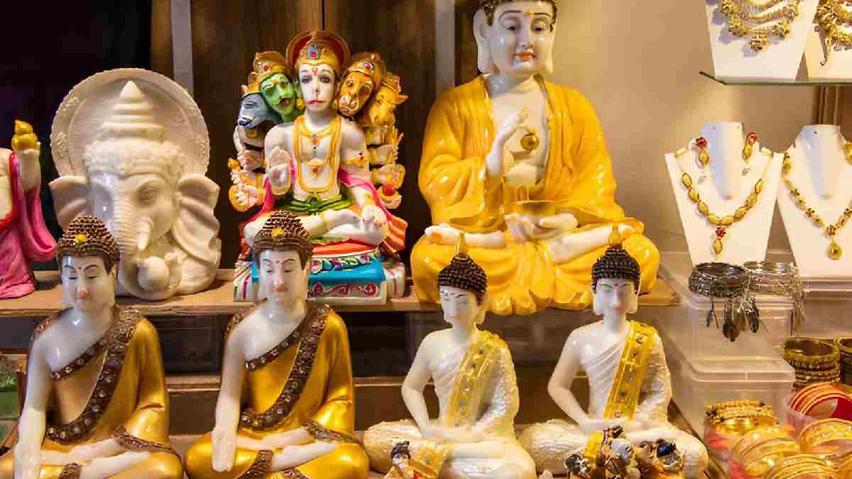
If you want a quick feel for differences between deities and details, an overview like hindu statue helps you see variation at a glance in hand gestures, attributes, and posture. When you can compare those features side by side, you’ll notice faster what feels recognizable, calm, or simply interesting to you.
Table of Contents
Start with your goal: what do you want the statue to do in your space?
Some statues feel visually larger than you expect. Broad shapes or multiple arms draw attention faster than a calm silhouette, even if the measurements are modest. So think first about the fixed spot: a quiet background often makes a statue stand out more strongly, while a busy sightline can create restlessness.
If you’re mainly looking for something for your interior, choose a clear silhouette. That stays “readable” even from a few meters away, without needing details to find it beautiful. A pedestal that doesn’t grab all the attention keeps the overall look calm.
If you’re looking for a statue for daily use on an altar, focus on practical points:
– A wide base tends to feel more stable on a flat surface.
– Fewer fragile protruding parts where you pick it up make handling and dusting easier.
– A posture and facial expression that feel pleasant make it something you’ll genuinely want to pause with every day.
If you plan to move or clean the statue often, a solid overall form is usually the most comfortable. With older pieces, details can be thinner and more fragile; calm, strong forms often give you more ease of use.
If you collect, you’ll want it to stay interesting up close too. Look for small variations in the surface: edges, protruding parts, and little corners often show more “life.” Extra detail photos of edges, protrusions, and the base help you judge that better.
Older or made to look old: how to read patina, wear, and repairs
A believable aging pattern usually shows where touch and protruding areas have had an effect. Three signals:
– Protruding parts: often more shine or a smoother surface.
– Corners and deeper relief: often a darker tone or more buildup of color.
– Transitions: tones usually blend gradually, not in hard blocks.
With metal, nuance often looks more natural than one uniform color layer. With stone, you often see (or feel) that raised areas look slightly more polished while deep areas stay more matte.
Restoration doesn’t have to be a problem; it can also improve stability or appearance. It helps if it’s clear what was done, so you understand what you’re seeing. A repaired area that quietly “reads along” with the rest often looks natural. If a spot stands out because of shine, sharpness, or a color difference, ask for close-ups. For display that can be totally fine; if you mainly want an even overall look, subtle repair often feels calmer.
Style and iconography: recognize the deity before you fall in love
Style helps you identify what you’re looking at. Attributes, mudra (hand gesture), and sometimes an animal or vehicle give you a way to see who it is. If that symbolism matters to you, make sure the photos actually show those features clearly (not just out of frame or disappearing into shadow).
If details are hard to read, ask for close-ups of the hands, front, back, and the base. And if you notice that lots of details make you hesitate, a simpler depiction (for example fewer arms or fewer accessories) can bring more calm.
Material and craftsmanship: watch for signs of mass production
In photos, a lot can look like bronze or stone, but the finish often gives away a lot. Variation helps: multiple tones, small differences in depth, and a surface that doesn’t behave exactly the same everywhere often look more alive.
Close-ups of edges, hairlines, jewelry, and the back quickly show whether details repeat exactly. If everything comes back *too* identical, it can feel more like mass production. With handmade work, you’ll see tiny differences instead: an edge that isn’t identical everywhere, subtle variation in depth, or slight asymmetry.
Also check dimensions and weight to avoid disappointment. A statue can still feel dominant because of its posture or pedestal, and a small statue can disappear on a large piece of furniture. If needed, make a paper or cardboard “footprint” using the stated width and depth—then you’ll immediately see how much space it really takes up.